This post was written in partnership with Adobe and Adobe Photoshop Lightroom.
A couple of weeks ago, I joined the Adobe team and a handful of other photographers in the Caribbean to experience and document the US Virgin Islands. It was a wonderful experience, and I am grateful that the Adobe team chose the USVI for this trip. The Virgin Islands are stunning, with gorgeous nature and vibrant culture. The hurricanes last year devastated much of the area, and many are still rebuilding. It was a privilege to visit and to see the resiliency and strength of the people here first-hand.
For this blog post, I wanted to look at the parts of my workflow and the ways that I edit in Lightroom that are pretty consistent across images. Below you will find my basic workflow and editing tips, broken down in simple terms, using my images from this trip to illustrate my points.
I have been to the Virgin Islands before–– I went to Saint Thomas on a few family vacations growing up. But I had never visited any of the islands with a purposeful interest in culture and the outdoors. Having the opportunity to visit with a lens on these things was something I wanted to make the most of.
Lightroom is my most-used application for photo editing, and I used it to process all of my images from this trip. I get a lot of questions about how I edit, and I want to start this off by saying that there is often not a “right” way to create. I know how intimidating the technical side of photography (or any craft) can feel. I have only been using Lightroom for a few years myself, but the more I use it, the more comfortable I get with it, and the more confident I feel using it.
There are two versions of Lightroom currently available–– Lightroom CC and Lightroom Classic CC. I mostly use Lightroom Classic CC, which is the desktop-only product previously known as Lightroom. Lightroom CC, on the other hand, is a cloud-based software that works across desktop, mobile and web. I use Lightroom CC for mobile (available for download as an app) on my iPhone X to edit photos on the go if I don’t have access to my desktop, or if I simply want to do a quick mobile edit.
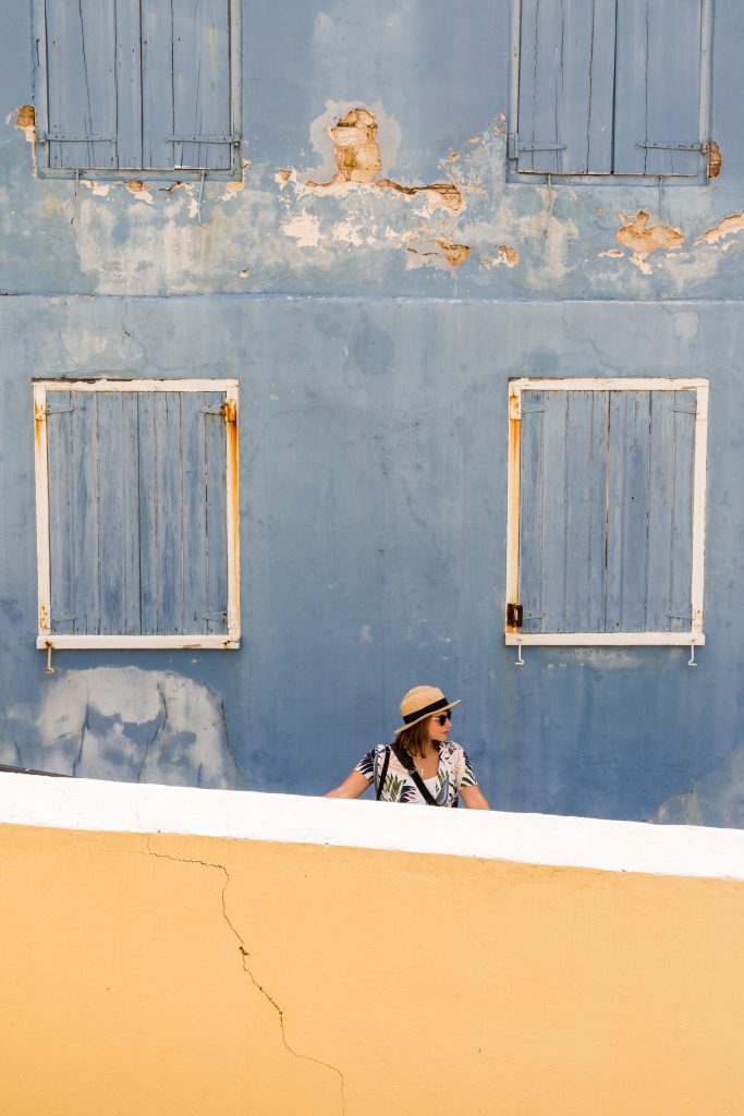
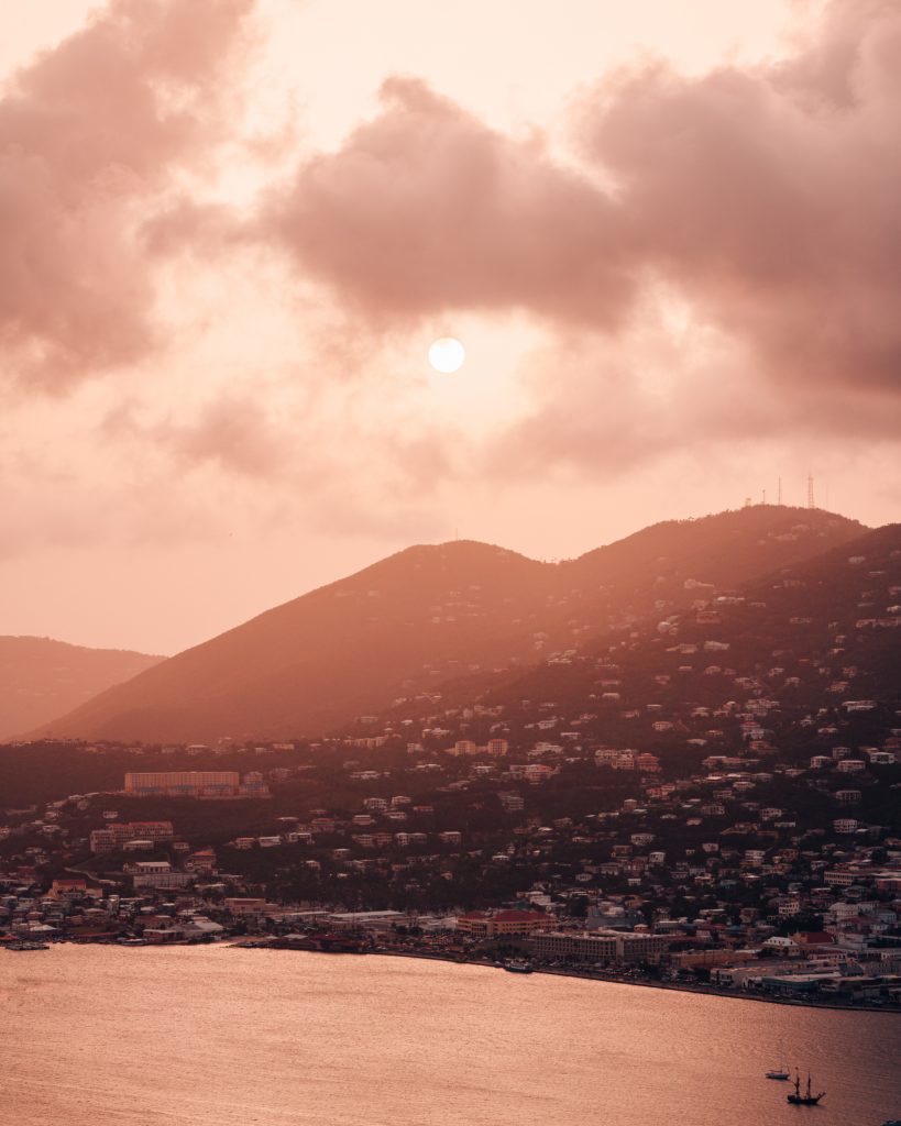
To start, here is what my Develop module in Lightroom Classic CC looks like after I edited the feature photo in this post:
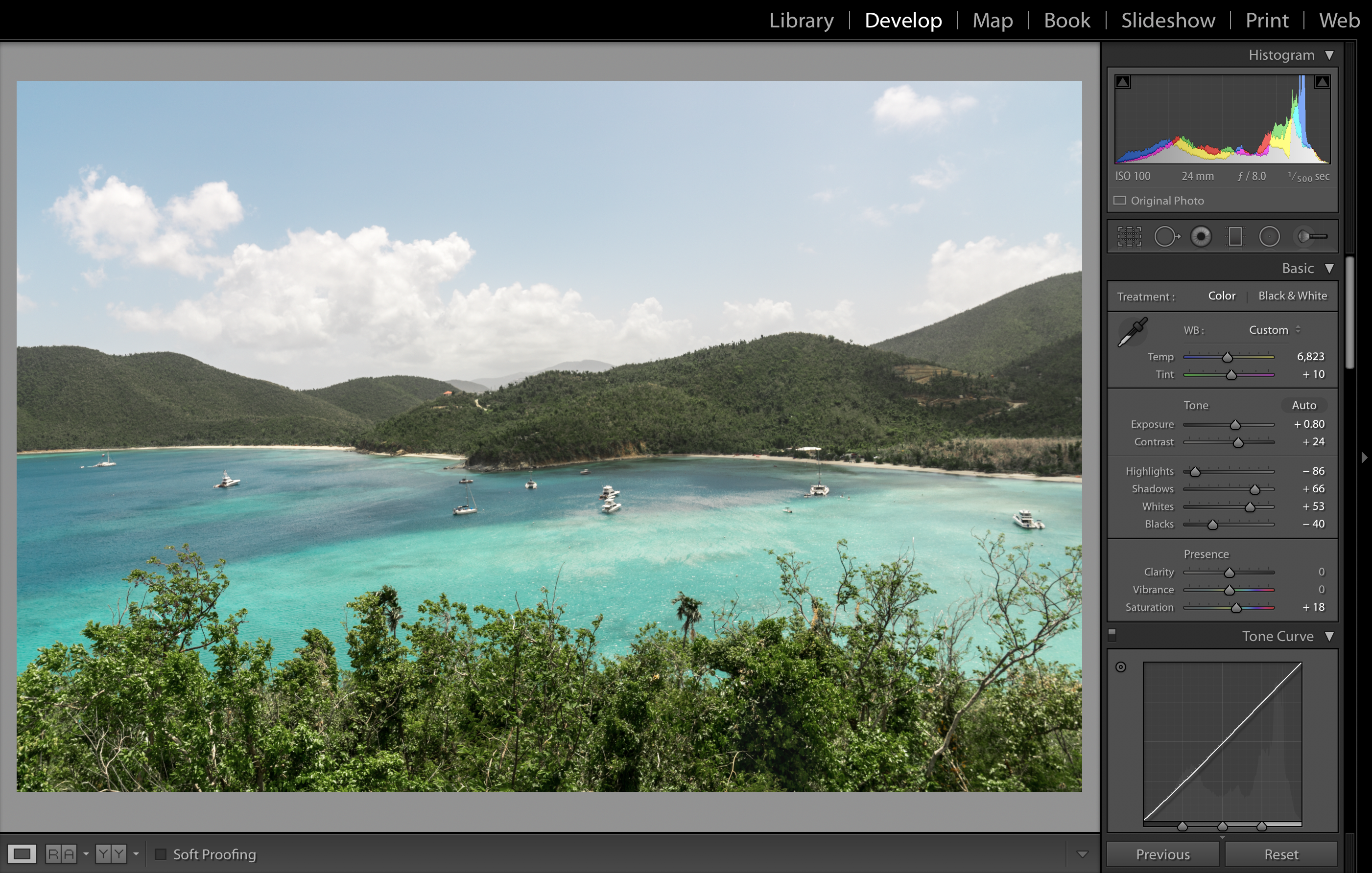
The Develop module is where I spend most of my time in Lightroom. You can see what some of my edits were on the right. Before I jump into editing tips, let’s talk about organization. It helps if you open up Lightroom so you can follow along throughout the post.
GETTING ORGANIZED
I shoot in RAW on a Sony a7Riii. RAW is a file format that allows you to capture the maximum amount of data from the sensor so you have more to work with in Lightroom. I import my photos from my memory cards by selecting “Copy” Lightroom’s Import dialog, designating my external hard drive as the import location. I will then manually copy a backup to a second hard drive. I carry two external HDD’s when I travel (I prefer these), and back up my photo/video from my cards daily. I make sure to have at least two copies of the RAW files at all times. Within my hard drives, I organize my images by date, and then by location or trip.
Once photos are imported to my Library, I will go through and pick my favorite images by flagging them with “p” (you can use “u” to remove a flag), or marking them with stars by using numbers 0-5. Once I’ve done that, I’ll go back to the Library and view only the Flagged images by using the Library Filter.
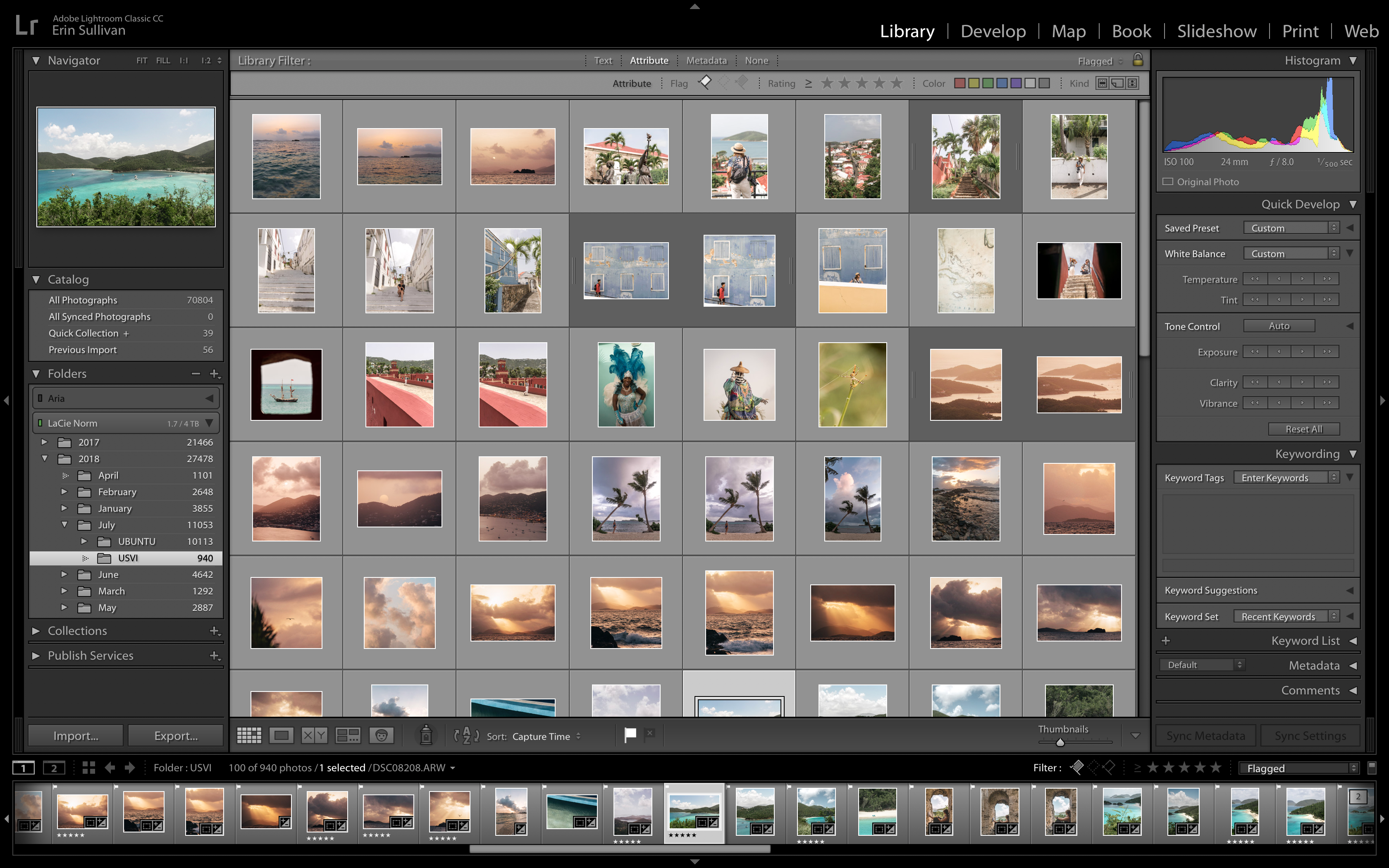
This is what my Library looks like when I select only the flagged images. Most of these image have been edited.
I’ll pick the image I want to edit and double-click it to head into the Develop module, where I spend most of my time in Lightroom.
CROP & PROFILE CORRECTION
The first thing I do is usually hit “r” to crop, or click the square grid icon directly below the histogram. You can rotate the image using your cursor, or click the Straighten Tool (looks like ruler next to where it says “Angle”) to draw a horizon line and make sure your image is exactly straight. If I am cropping for Instagram, I crop 1×1 (square) or 4×5 (vertical).
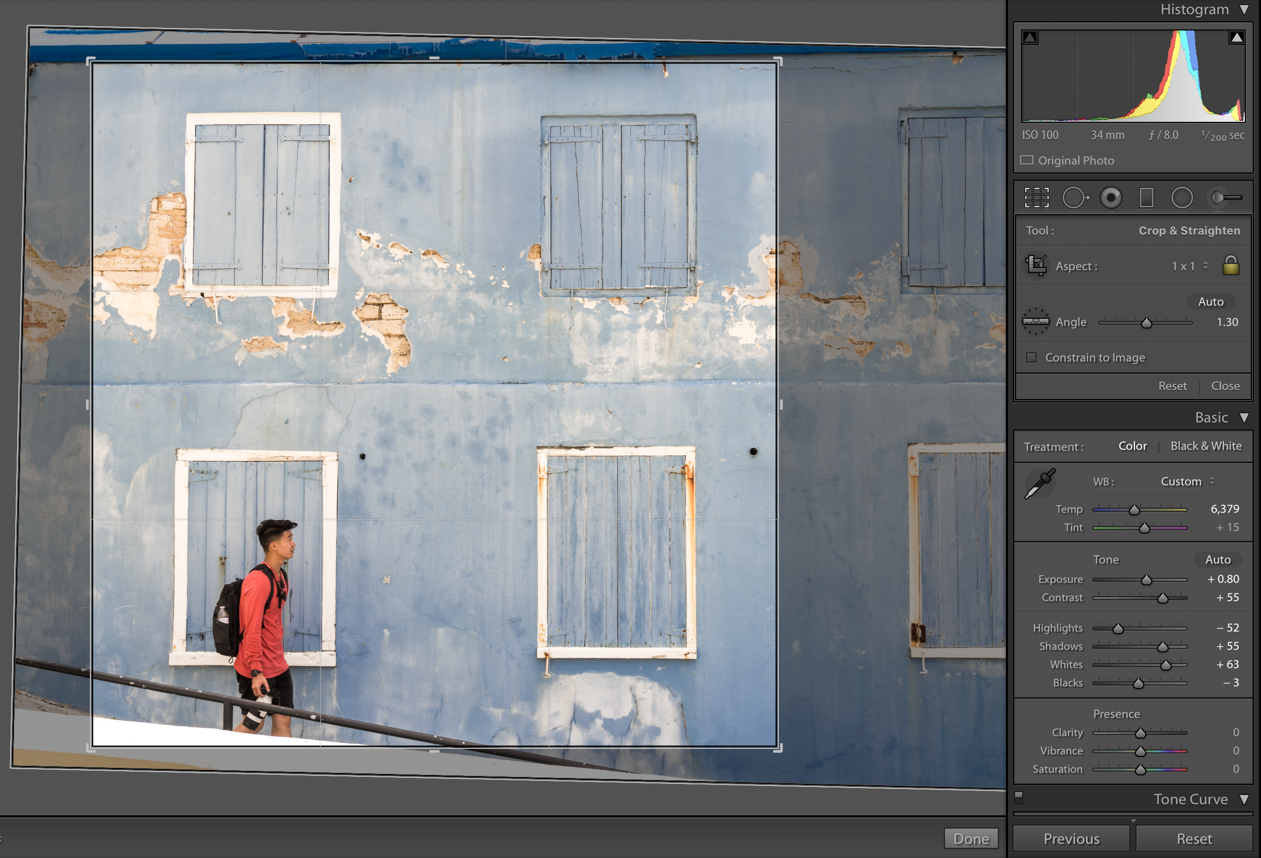
I am cropping this photo for Instagram, though I will probably also save a version at its initial ratio.
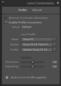
Profile correction is used to correct distortion and vignetting, specific to the lens used. To use it, scroll down until you see the Lens Corrections panel on the right, check “Enable Profile Corrections”, and select your camera and lens from the dropdown.
HISTOGRAM
The histogram is found in the upper-right corner of your Develop module. It is a tool that acts as a second pair of eyes–– the histogram is a graphical representation of the tones in your images. By reading the histogram, you can see what is going on with the blacks, whites, shadows and highlights of your image without you having to even look at the photo. This is valuable because sometimes we can’t trust our eyes to tell us exactly when the highlights are blown out, or when the shadows are too dark.
Here’s an image from Sapphire Bay with the corresponding histogram.
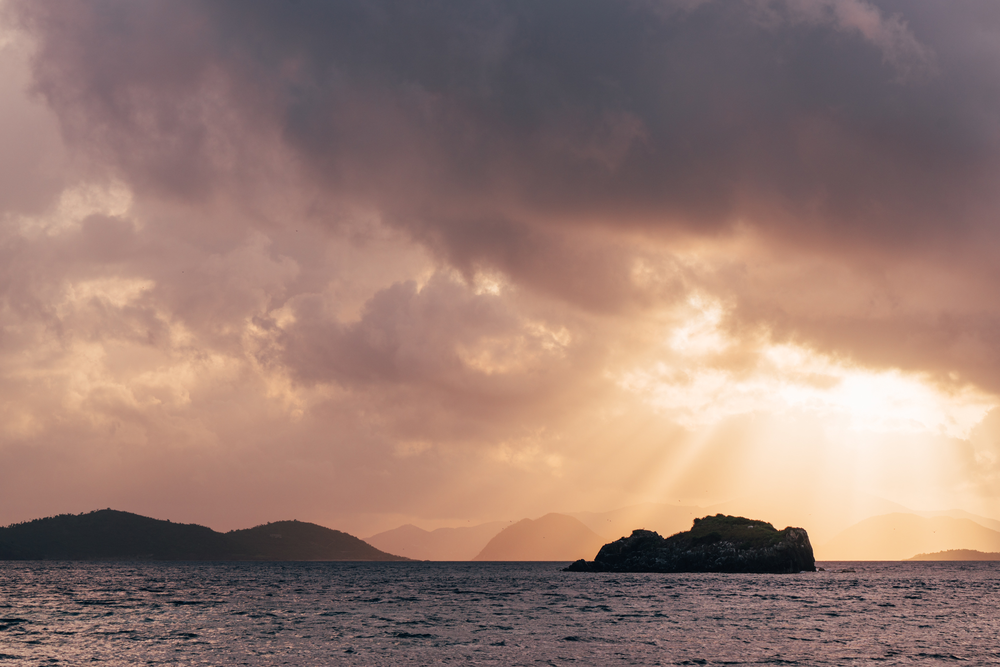
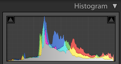
Dark tones are on the left side of the graph, while light tones are on the right. A “perfectly exposed” image will have a perfect bell curve that just barely touches the left and right side. That being said, not all images will look good just because the histogram indicates that they are “perfectly exposed”… sometimes you want to purposefully under or over-expose an image. There is no such thing as a “good” or “bad” histogram. It’s simply a tool for you to use when you make your creative decisions.
According to the histogram above, you can see that this image is mostly made up of midtones, because you can see a lot of action in the middle of the graph. By hitting “j”, you can see if any areas are “clipping” which means either your lights are TOO light, or if your darks are TOO dark. You can also see if clipping is occurring if part of the histogram is touching the right or left side. In the histogram above, you can see that no clipping is occurring, but that the histogram is just barely touching the left and right sides.
I want to note that I enable the histogram starting from when I’m shooting. On a Sony camera, this is one of your display options. With the exception of photos that are intended to be very dark or very bright, I pay attention to the histogram when I am shooting to try to center the midtones in my frame.
BASICS: WHITE BALANCE & TONE
Lightroom gives you two sliders for adjusting White Balance: Temperature and Tint. The Temperature slider makes your image warmer or cooler, while the Tint slider balances out the magenta and green in your image.
I use the white balance selector (looks like a temperature dropper) to select the most neutral (i.e., grey) part of my image. Sometimes our eyes deceive us and tell us that an area is neutral, when it really has color in it. You can tell if an area is really neutral if the R (red), G (green) and B (blue) values are similar. Once you select a target neutral, Lightroom will adjust the image accordingly based on the grey you selected. I find the white balance selector to be an easy way to get a good base for further adjustments.
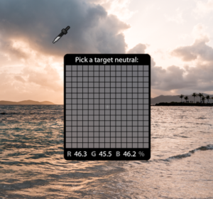
Check out the RGB values here. They get pretty close to equal, so this is very close to neutral.
White balance is subjective. Sometimes I change it really dramatically on purpose, and other times I want to get as close to true colors as possible.
If manually adjusting the tones feels overwhelming or too complicated, I would recommend just hitting the Auto button in your Basic panel to see what Adobe thinks your image’s tones should look like. Then you can work from there.
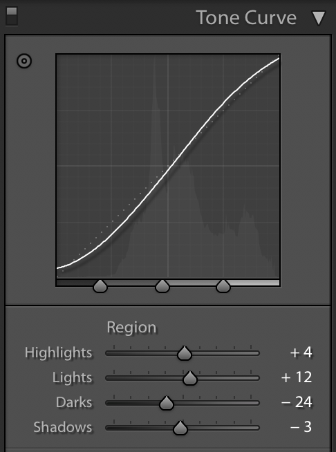
Another way you can adjust your tones is by using the tone curve. The tone curve: what the heck is it and why should you care? The tone curve is a tool that represents all the tones in your image. The shadows, midtones, and highlights are along the bottom axis. Moving any point along the curve up or down will make it brighter or darker, respectively. For example, to create contrast, create an S curve, which darkens the shadows and lifts the brights. Again, use “j” to check that you’re not overdoing it.
Here’s the before and after of an image where I adjusted the Tone Curve. You can see that I brought up the shadows a bit to create a slight fade, then increased the contrast by pulling down the darks and increasing the lights.
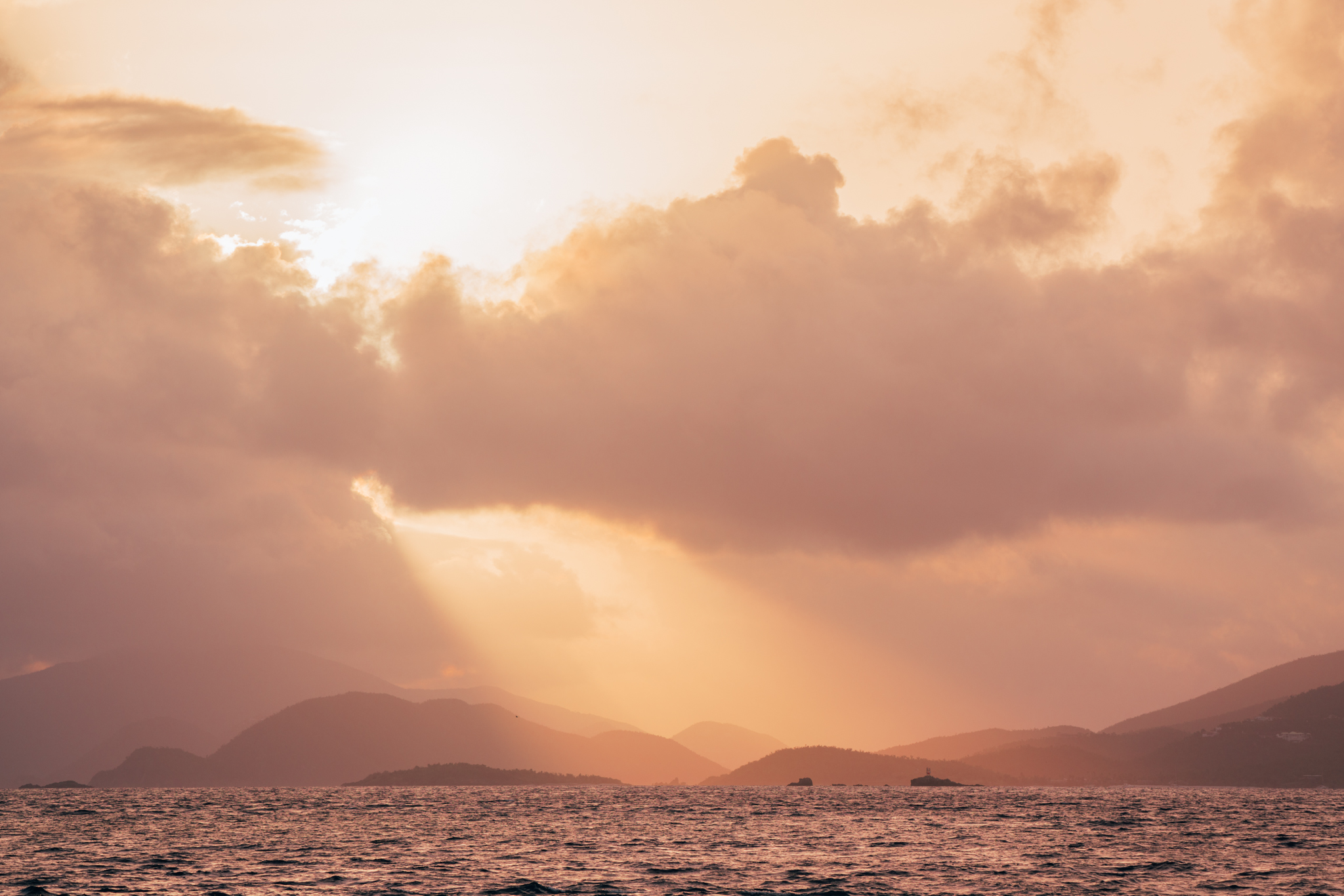

Whether or not you use the Tone Curve is up to you. Do you need to use it? No. Personally, I find that I mostly use the Basic panel, and then fine tune using the Tone Curve.
HSL & COLOR MANIPULATION
The HSL Panel (Hue, Saturation & Luminance) is a fun place to be in Lightroom. By adjusting the tones in your image, you are also affecting the appearance of the colors. The HSL panel is the place where you can precisely manipulate and adjust all the colors in your image.
You can choose which colors to adjust by specific hue, or use the targeted adjustment tool for more precision. This tool is something I use on almost every photo! To use it, click on the circle in the upper left-hand corner of the HSL menu. Then find the color you want to adjust in your image, click and drag your cursor while holding down. This is a great way to adjust specific colors without having to guess how much of each hue is in the selection.
The targeted adjustment tool is that circle icon with the two arrows.
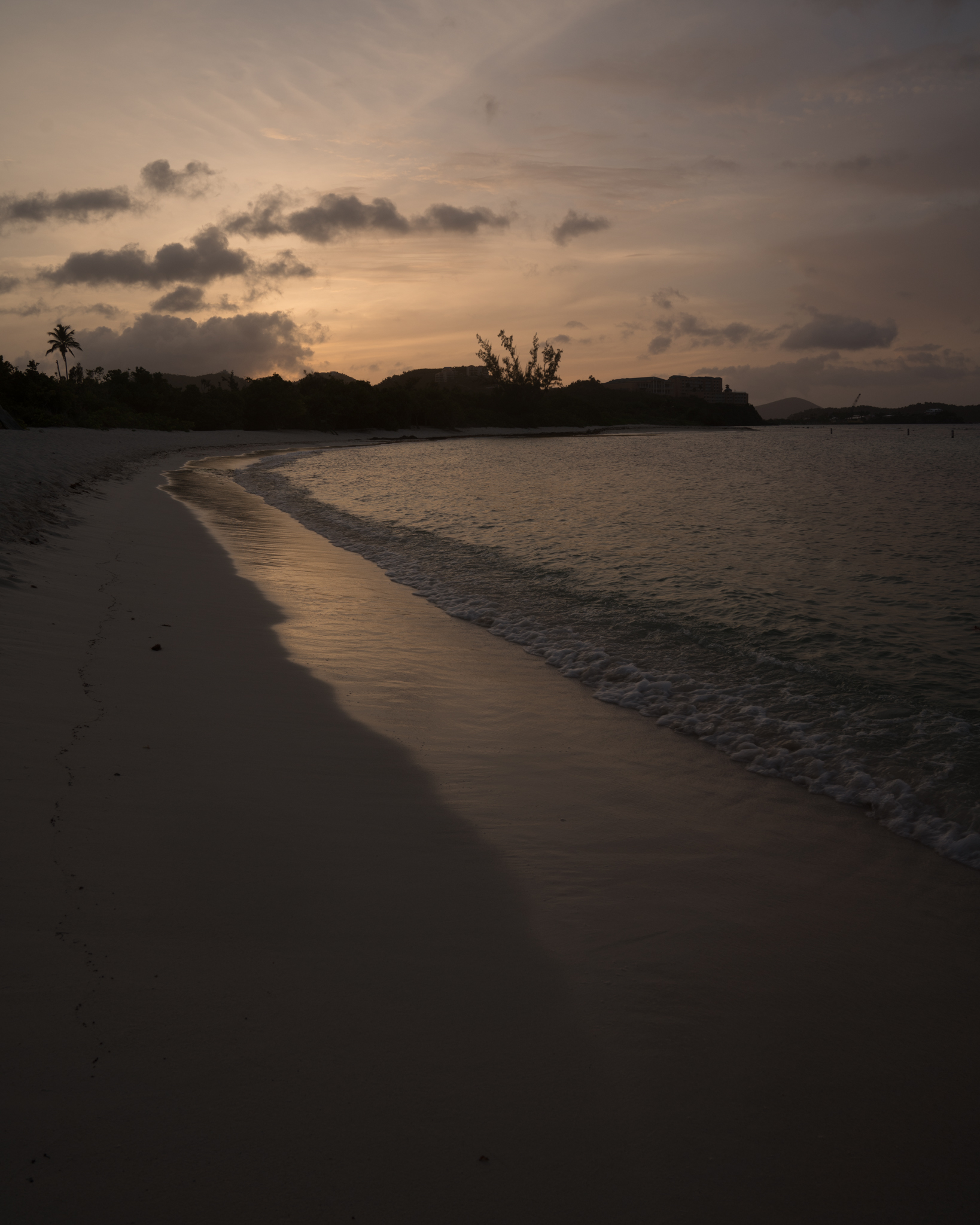
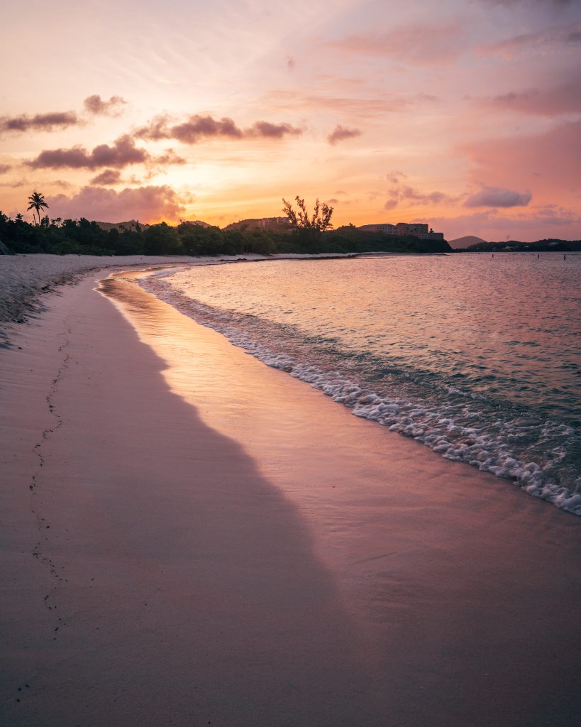
Some of my images are more altered than others with regard to specific colors. Here’s the before & after of an image where I adjusted almost every single slider. Hopefully you can see why I chose to edit this one so heavily!

Here is the final image next to the HSL panel so you can see the adjustments I made:
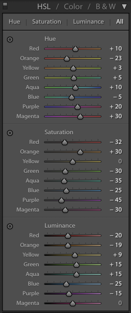
How much or how little you use the HSL panel is up to you. I find it to be extremely helpful, and this is probably the place I spend most of my time.
SELECTIVE EDITS
I typically do some selective adjustments on every image–– by that I mean spot removal, or adding a gradient or radial filter, or applying adjustments to a specific area with a brush. Spot removal is great for any minor imperfections, or if I want to clean up an area of the image a bit. If you aren’t sure what each of the tools does, hover over it for a moment until the name of the tool pops up.
I use often gradient and radial filters to adjust for any over or under exposed areas. I also use a radial filter on wildlife photography, specifically on eyes and faces, to bring out the detail. The brush tool is great if you have an area that isn’t a uniform shape, so that you can be more specific with the area you’d like to adjust. There is a point at which I will bring an image into Photoshop for more precision with these types of adjustments.
Here’s an example of using a Radial Filter to bring up the exposure in a specific area:
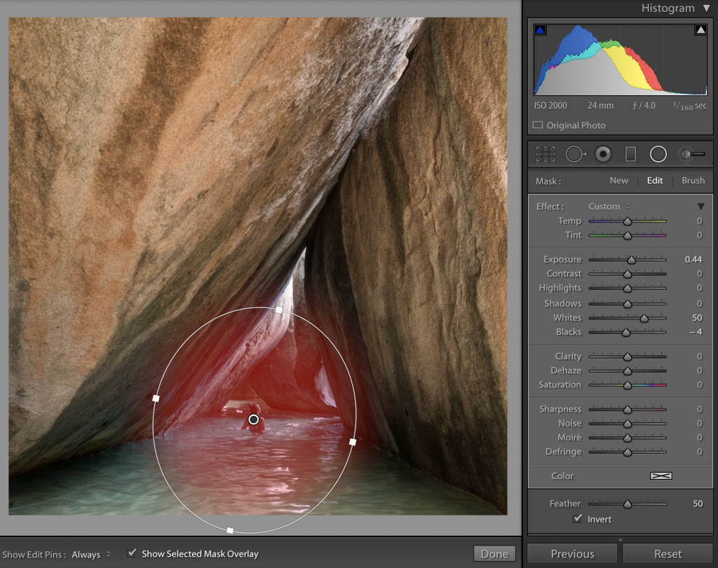
As you can see from the Mask panel on the right, I brought up the Exposure and the Whites, and brought the Blacks slightly down to create some contrast. Check out the final result in the image gallery at the bottom of this post.
COPYING, PASTING AND SAVING YOUR EDITS (CREATING PRESETS)
If I am editing photos from a set, I copy/paste the edit from the first image to the rest of the set. You can see the “Copy…” option in your Develop Module on the lower left, just above the film strip that runs along the bottom of your screen. Here is what I usually copy from an edit I like:
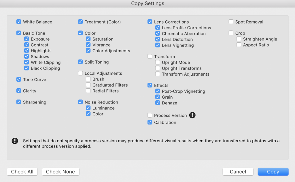
After copying these settings, go to the image you would like to edit and click “Paste…”. Voila!
I still go through each image individually to adjust exposure and other minor things, but copy/pasting an edit you like onto an image is way easier and faster than starting from scratch. I sometimes will save these edits as a preset so I can use it in the future for other images. To create a custom preset, once you finish editing an image, go into your Preset tab on the left and hit the “+” sign.
Do I use presets? Sometimes! I tend to experiment with presets if I feel stuck on an image and want to see if I can do something different. I will never just slap a preset on an image and call it a day, but sometimes I use them as a tool for experimentation or learning something. I have a couple of VSCO preset packs that I like to play with.
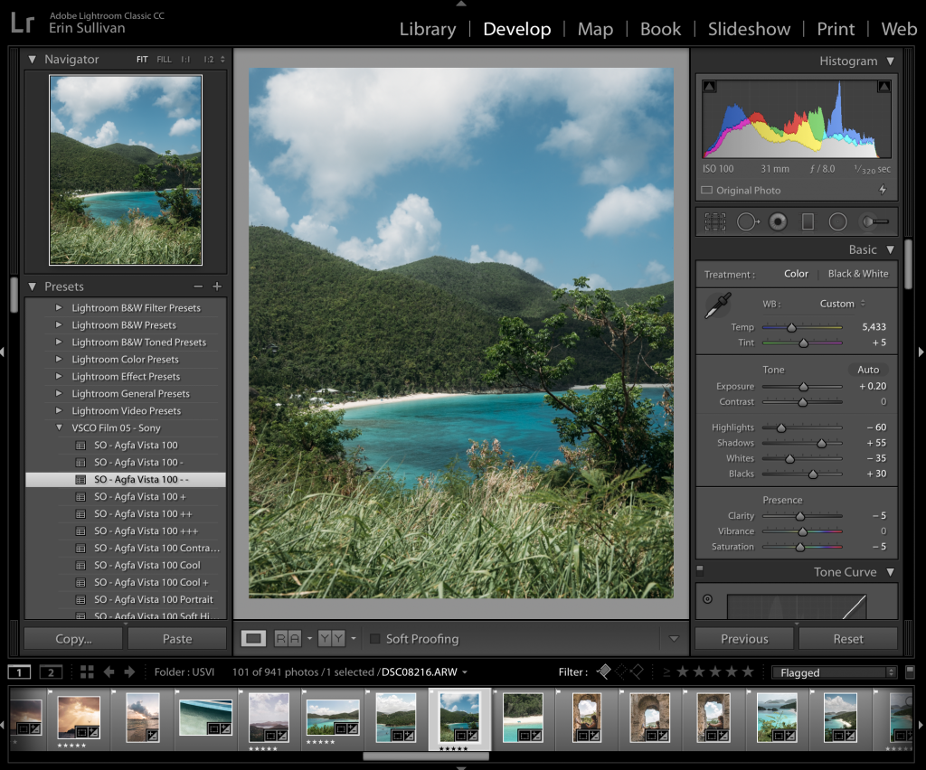
Here’s one of my images with a VSCO preset on it. I find it a little extreme for me, but I would consider using this as a base and working from there. I also like to ask myself what exactly I like about the preset. On this image, I like what is happening with the greens in the front, so I might reset everything and try to emulate that. For me, presets are a fun tool for learning.
Once you’re at a good place with your image, you can hit “l” twice to see it uninterrupted with a plain background. Hit “l” again to exit.
EXPORTING YOUR IMAGES
My three most-used export settings are:
- For web (blog/Facebook). Width of the image at 2048px; resolution at 72 pixels per inch.
- For Instagram/Instagram stories. Short edge at 2048px; resolution at 72 pixels per inch.
- For print. Do not resize; resolution at 300 pixels per inch.
The main differences between these are size and resolution. Here is what it looks like when I export something for web:
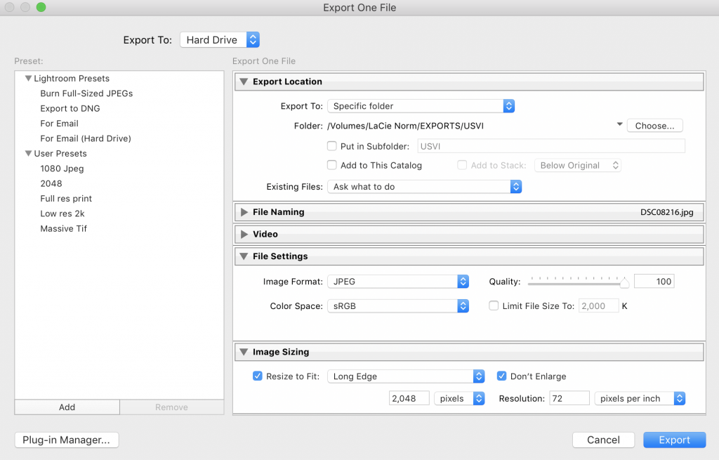
If you have file size limitations, you can check the box that says “Limit File Size To:”, but this may reduce quality. For print, I change the resolution to 300 pixels per inch, and uncheck Resize. Files exported for print will obviously be a much larger size than those exported for web.
In general, the go-to resolution settings for web and print are 72 ppi & 300 ppi, respectively. Anything below 72 will appear pixelated for web, and anything above it might be overkill (though some screens can display more ppi).
You can save your export settings as a preset by clicking “Add” under the preset panel on the left.
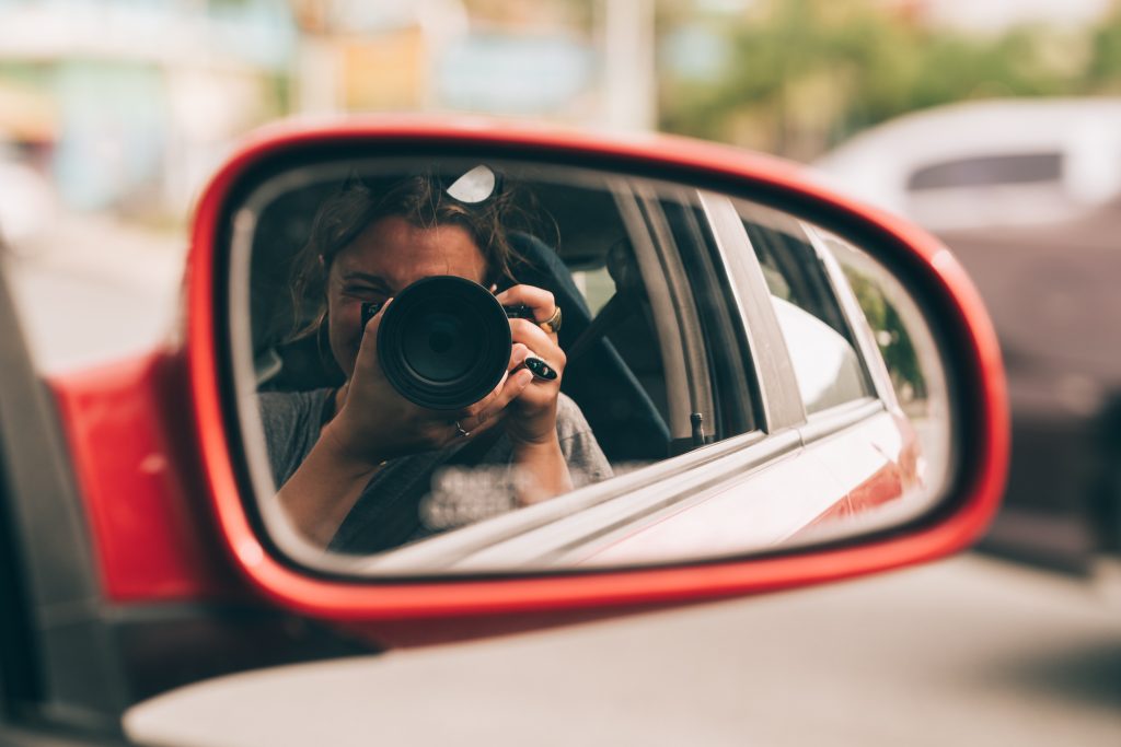
Lightroom is a powerful program and by no means did I cover it comprehensively here–– but I wanted to give you an idea of the steps I take from import to export. I hope that taking you through this process has helped your understanding of Lightroom, and given you some more confidence to try new things on your own images.
I hope you allow yourself the freedom to experiment. Sometimes I spend hours on one image and feel like I just can’t get it right. Other times, I love the end result after just a few simple tweaks. Figuring out what you like takes time, and a personal style can only come from hours of practice. Give yourself enough grace to try, day after day. Lightroom is a tool that helps you do that.
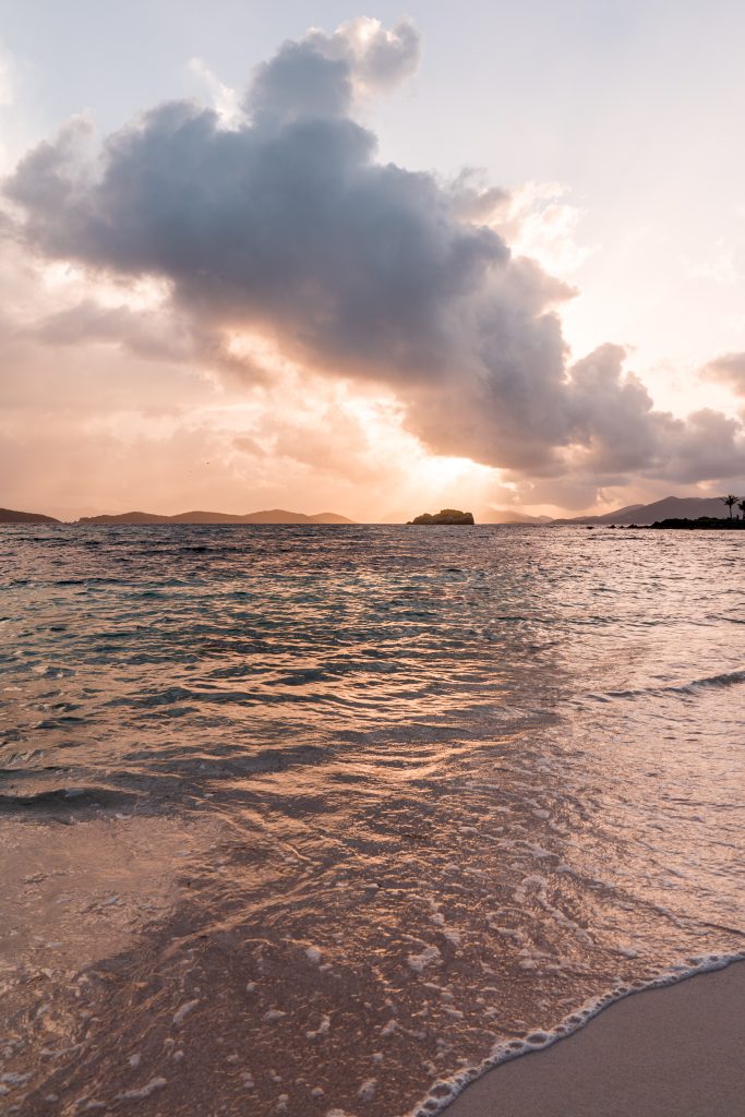
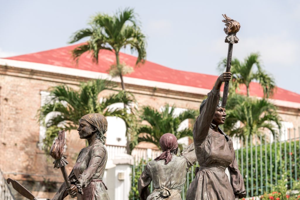
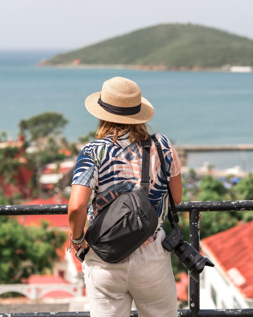
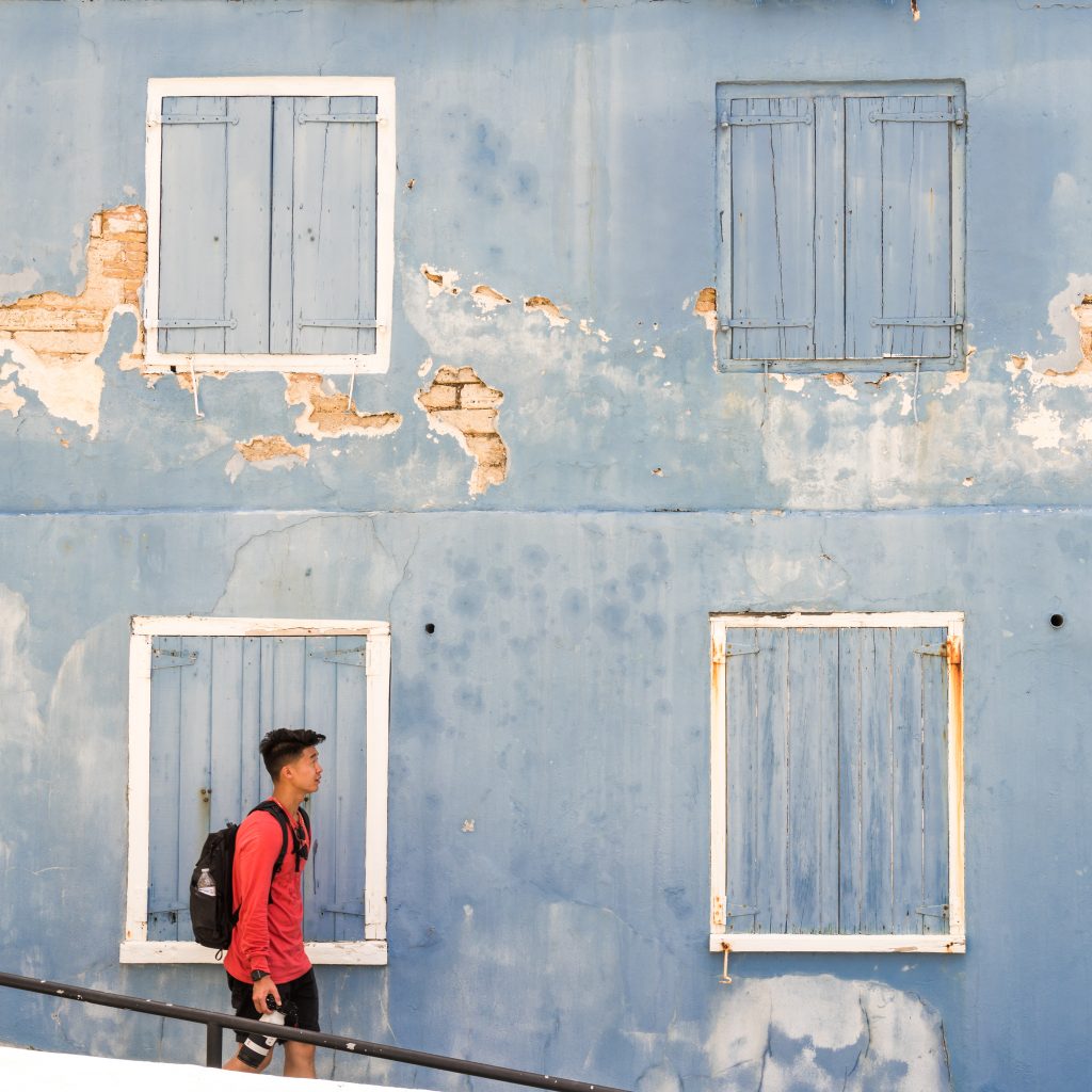
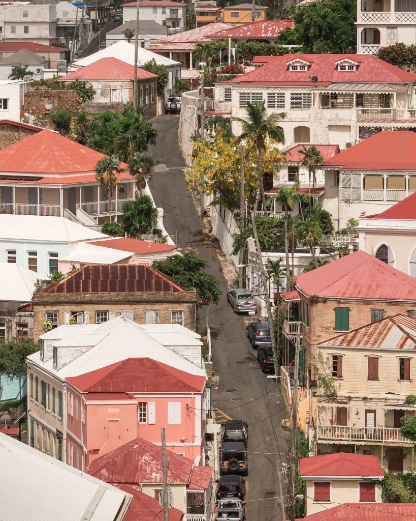
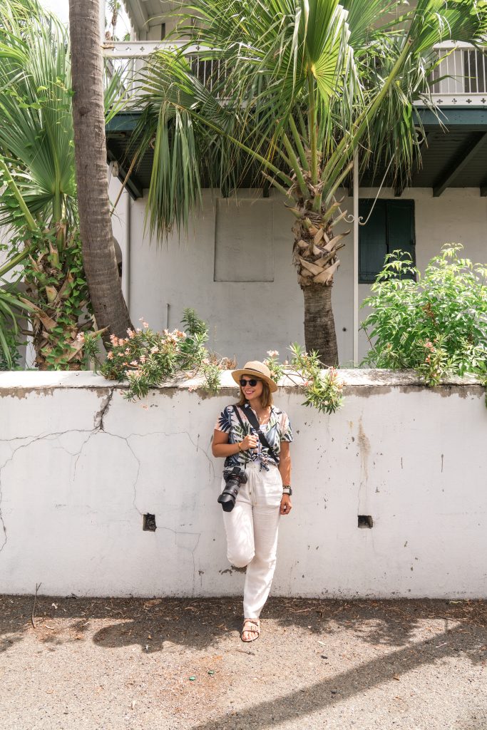
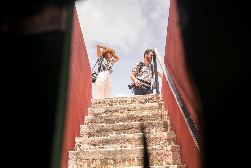
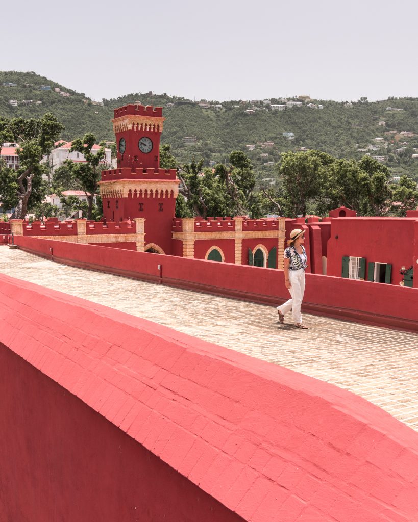
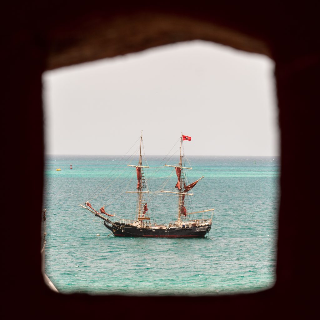
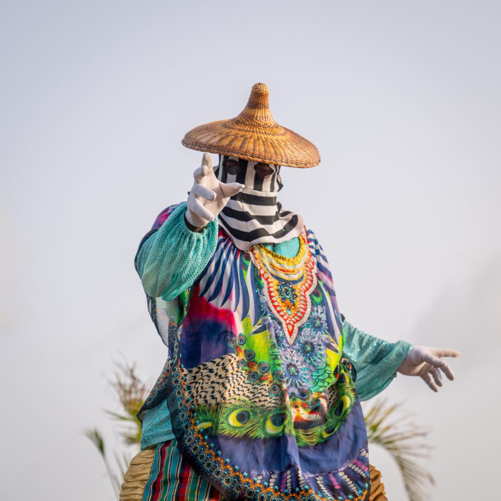
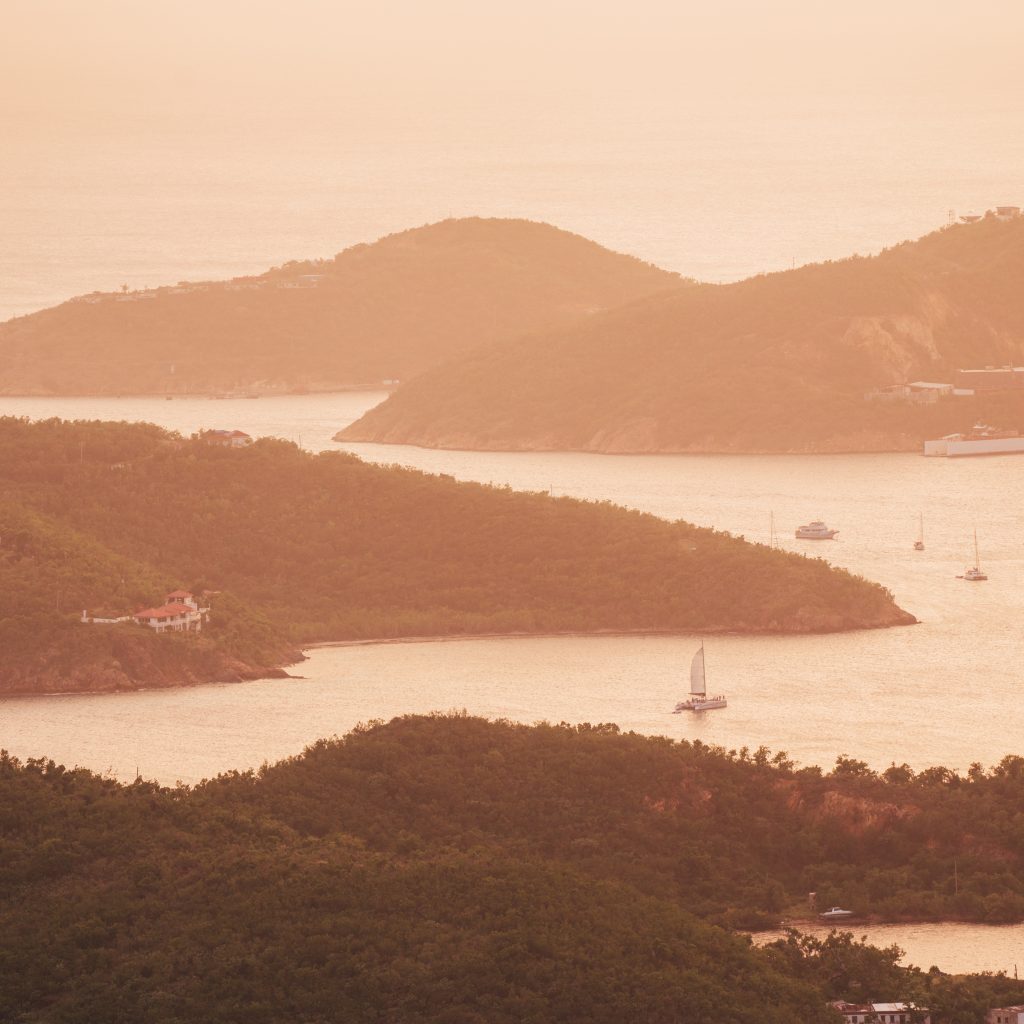
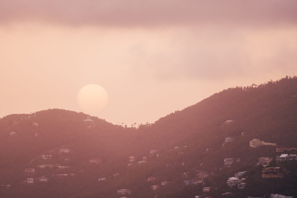
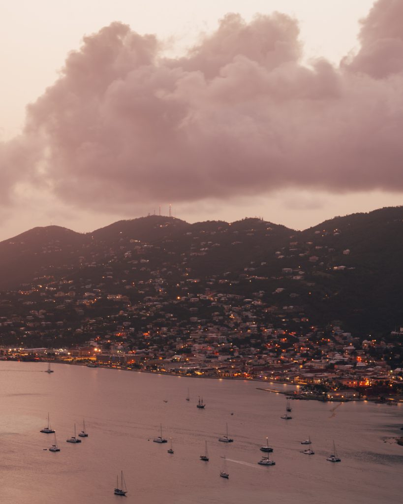
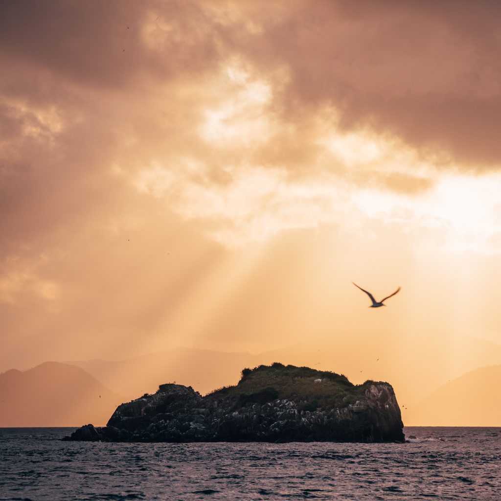
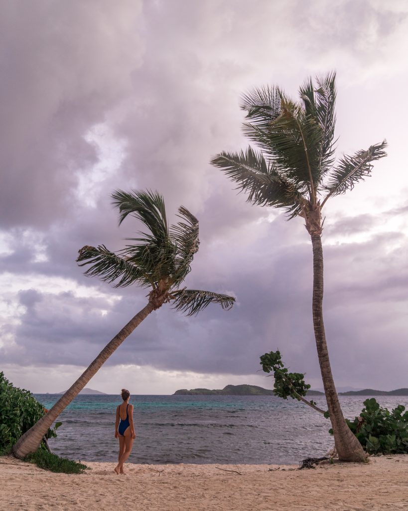
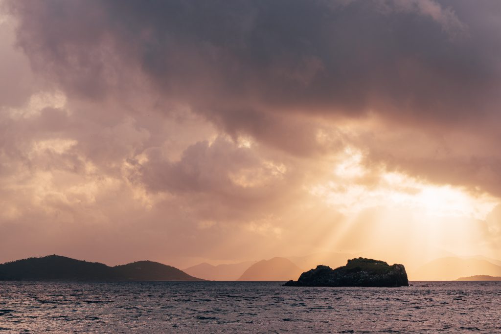
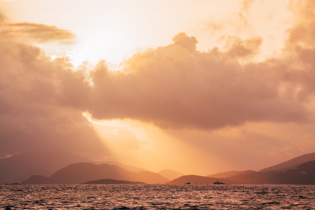
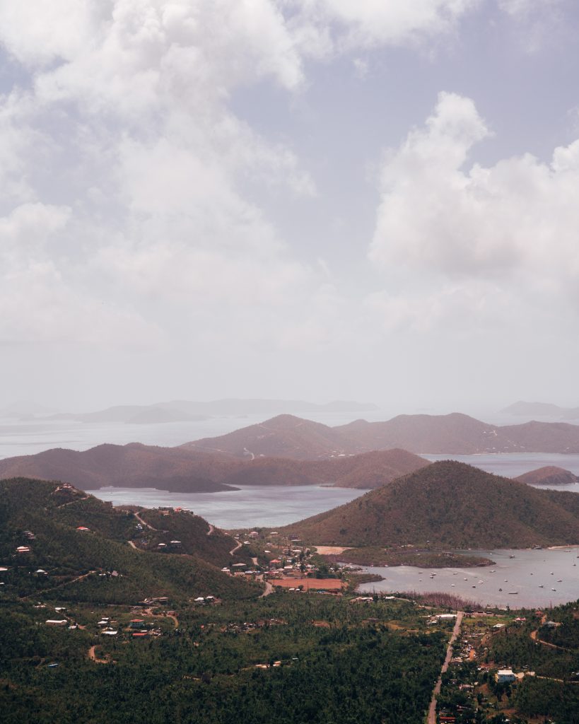
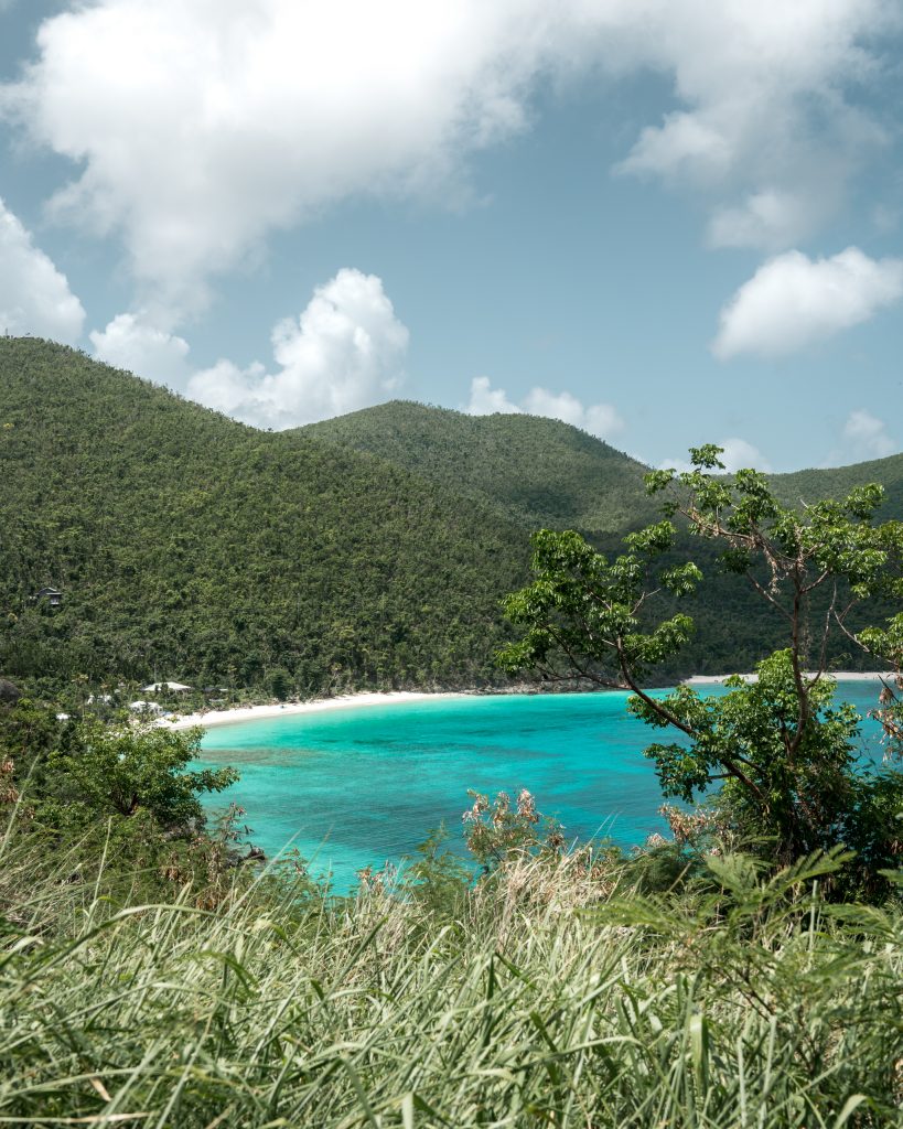
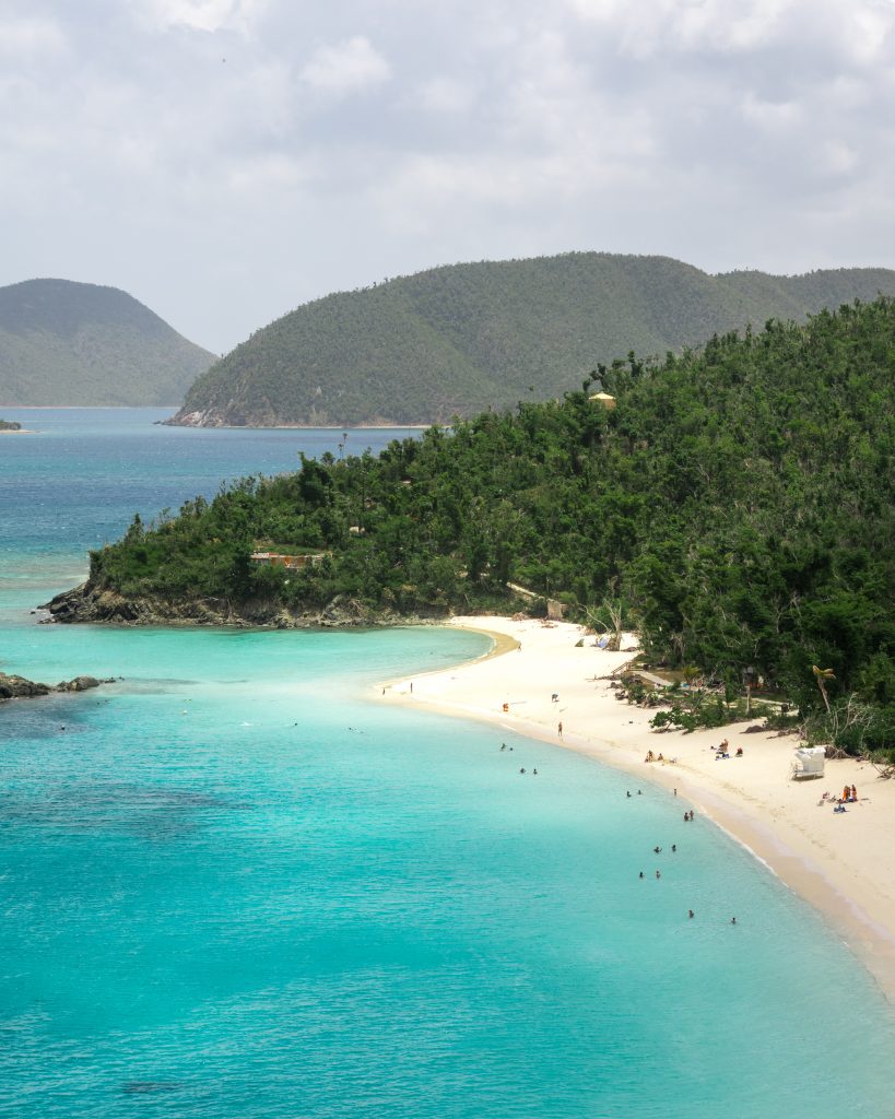
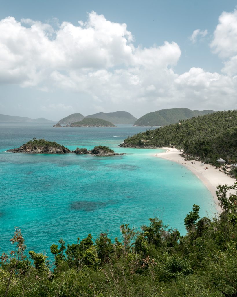
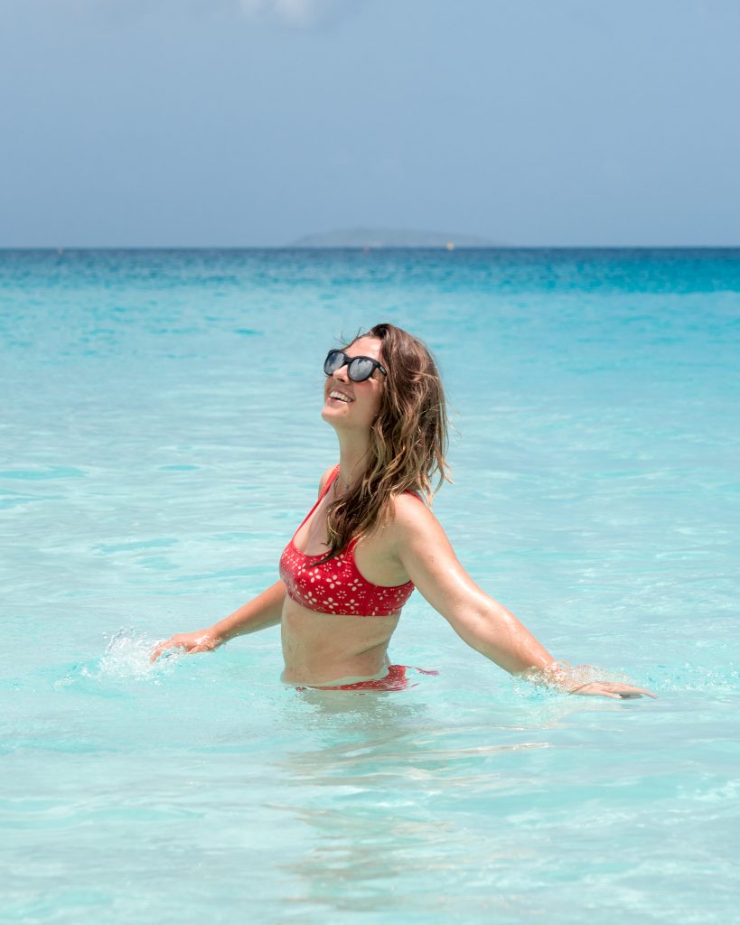
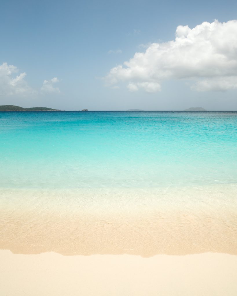
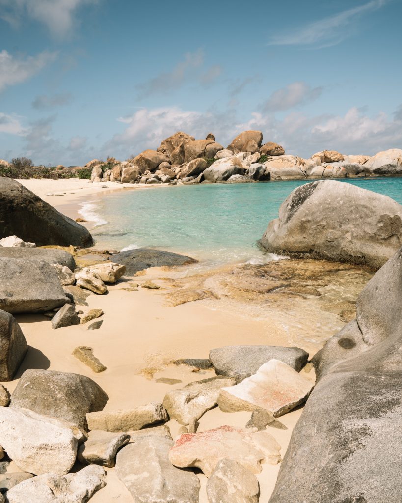
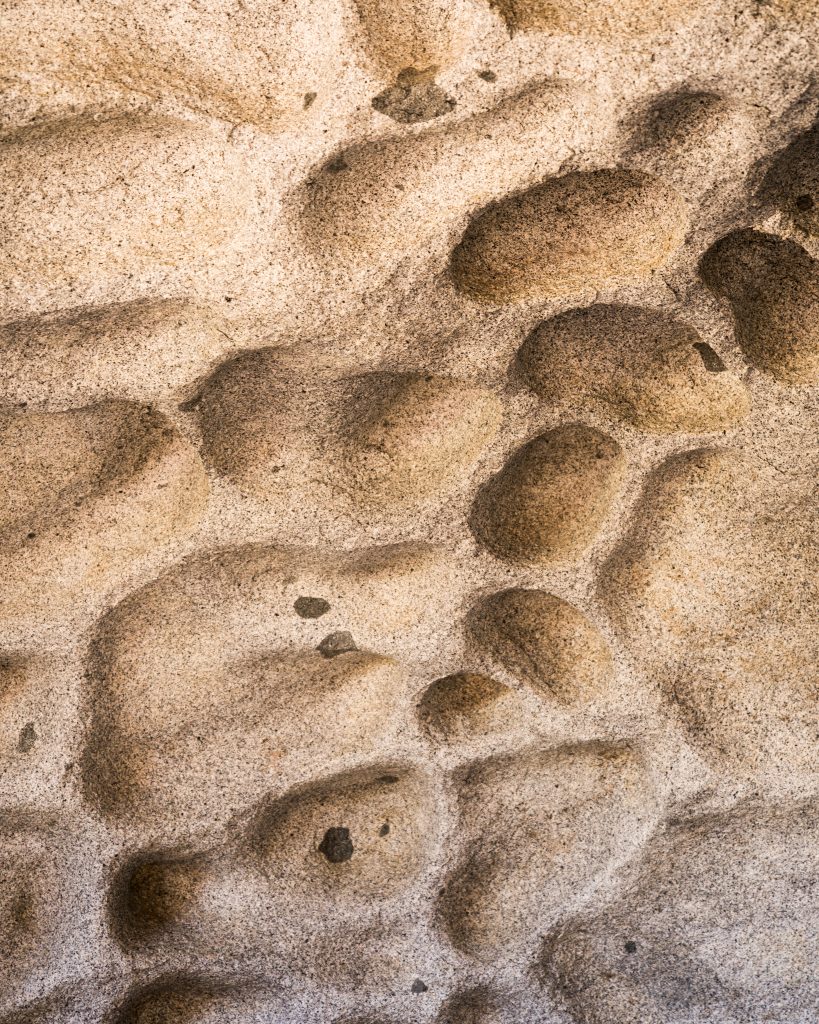
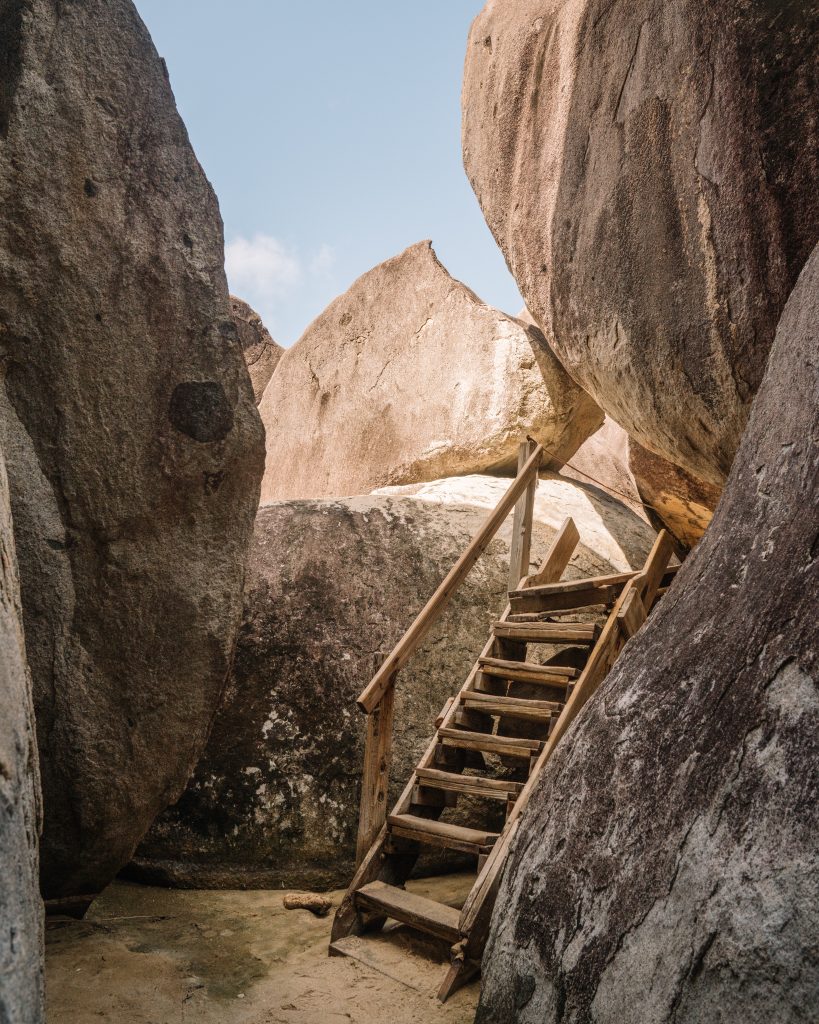
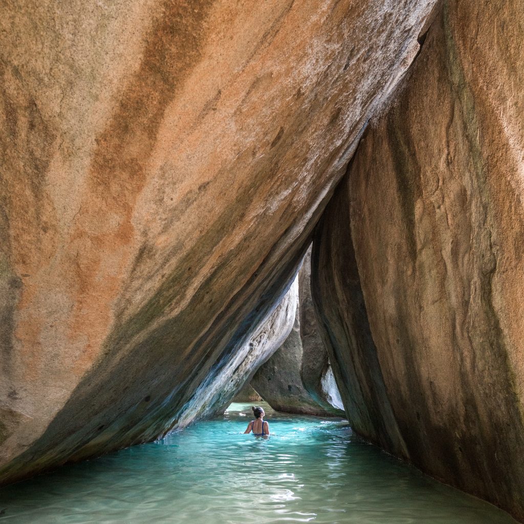
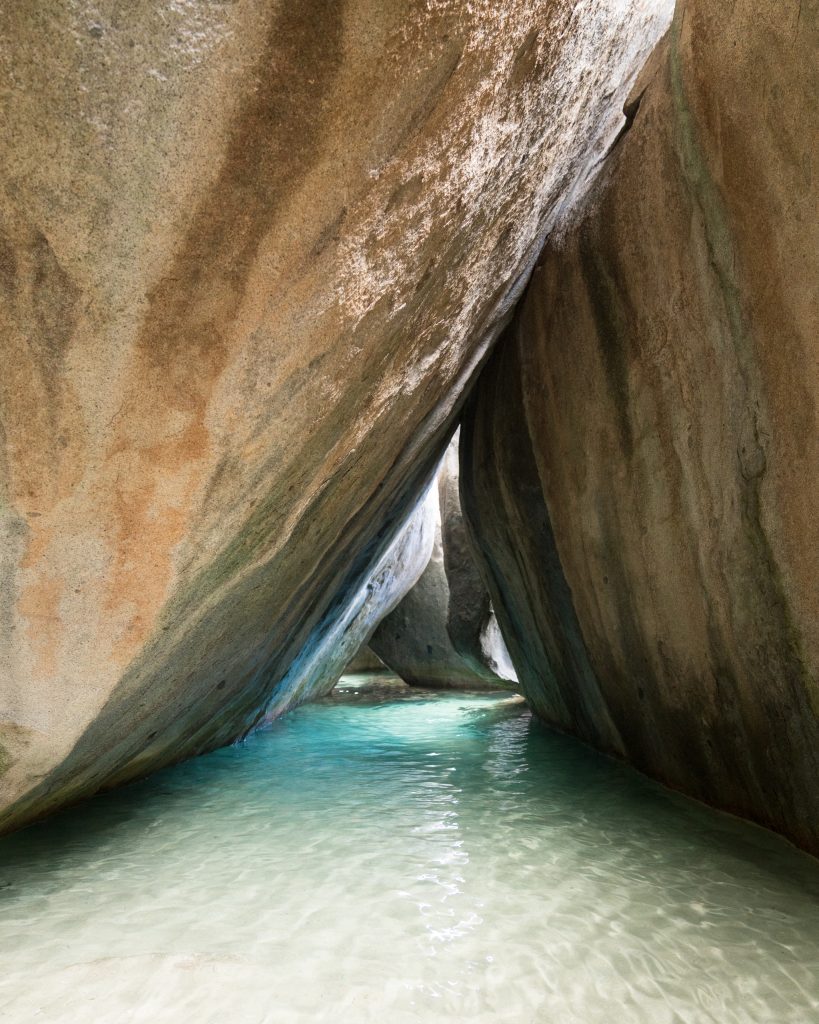
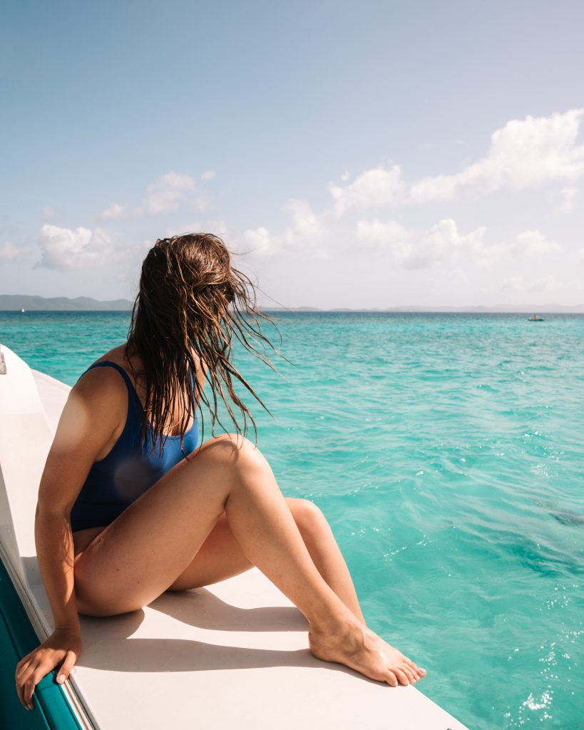
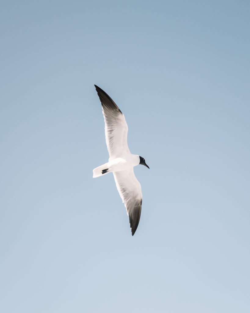
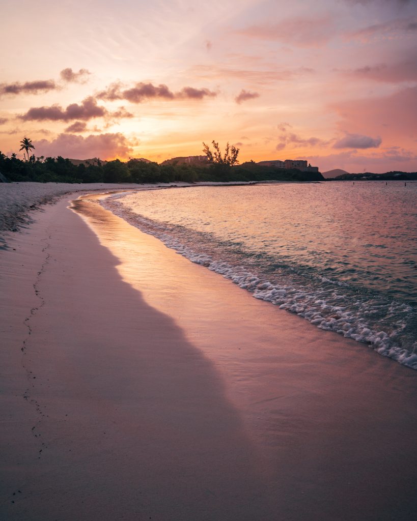
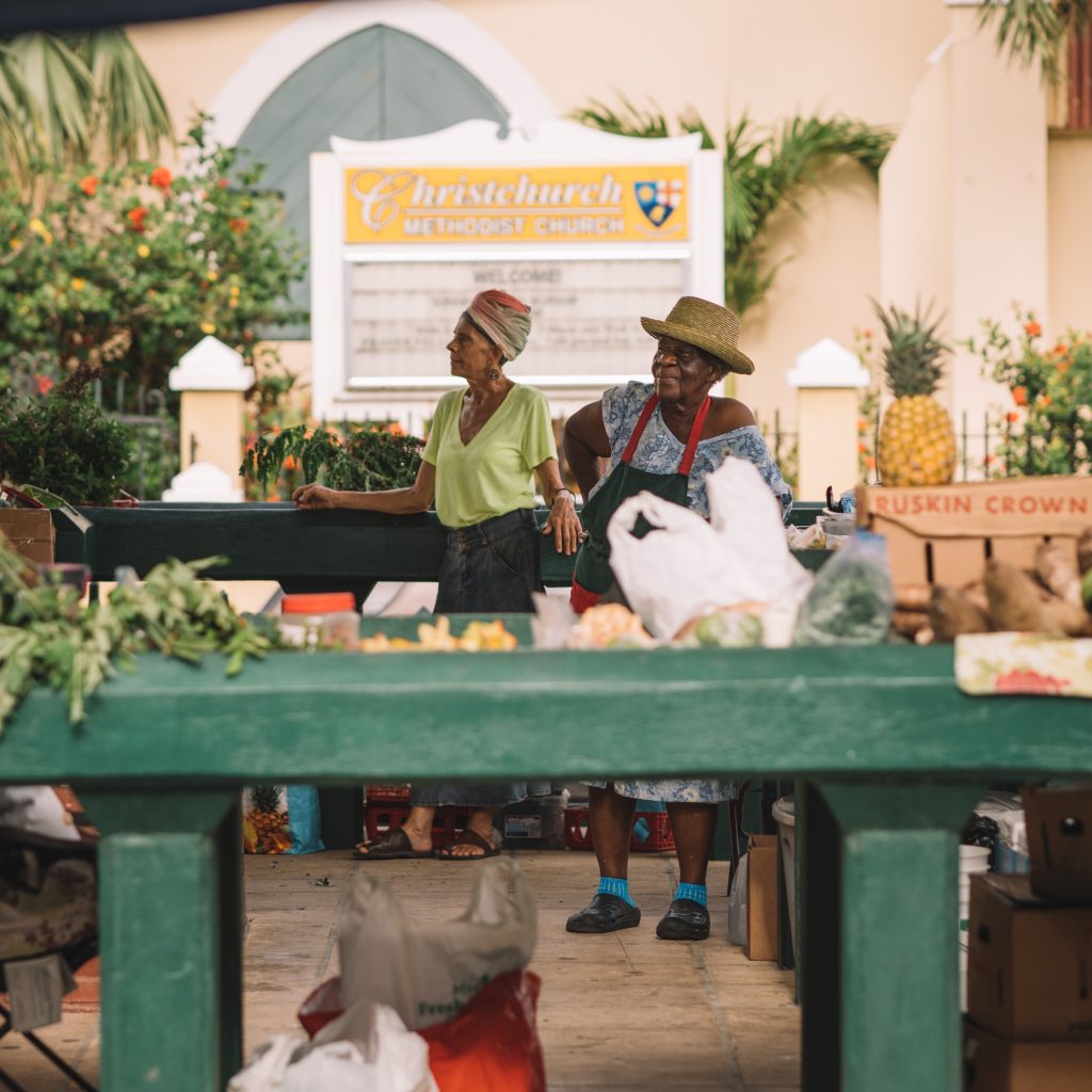
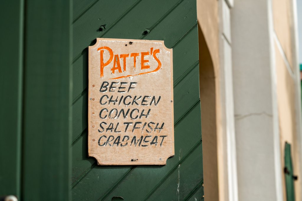
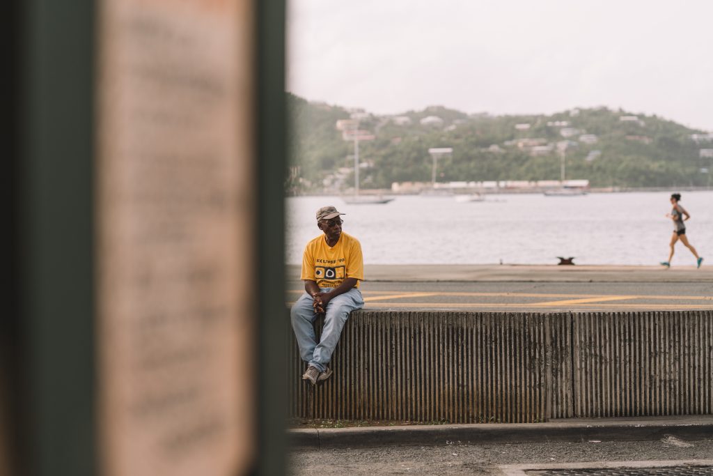
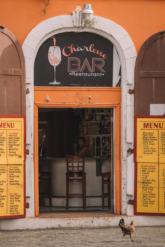
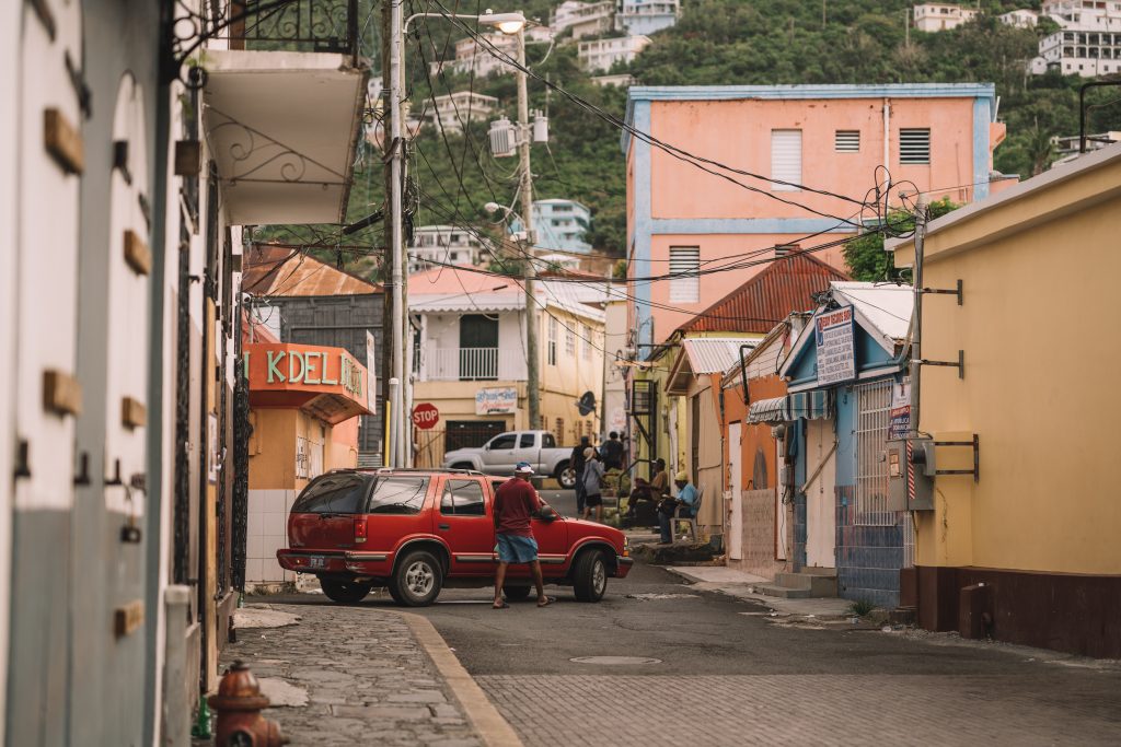
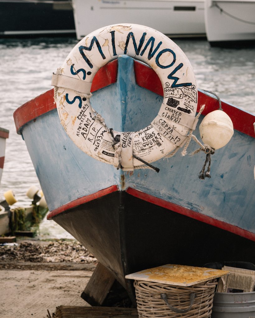
Finally, here are my favorite edits/images from our trip to the Virgin Islands. Thanks for reading!
GALLERY: CLICK IMAGES TO VIEW IN SLIDESHOW
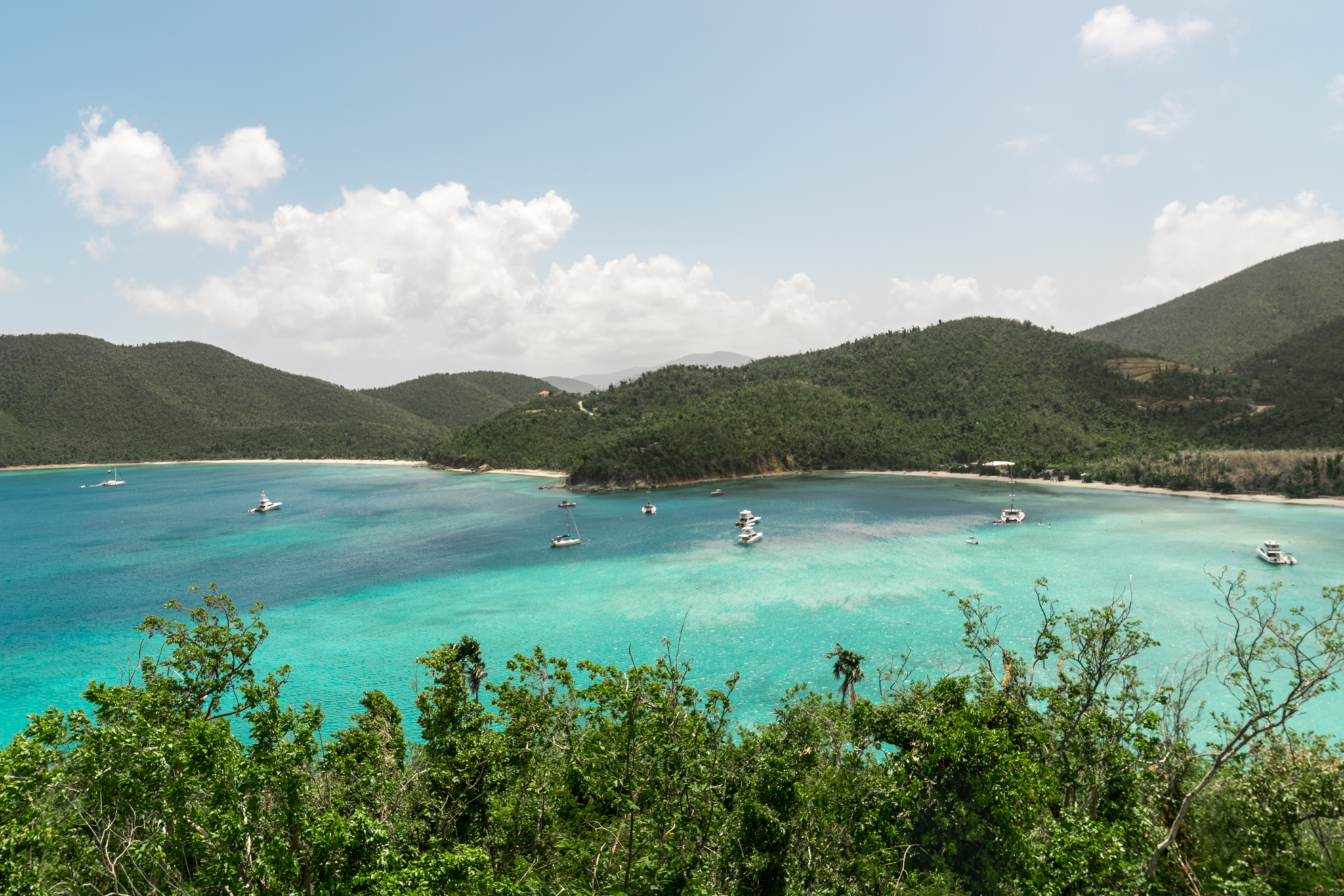
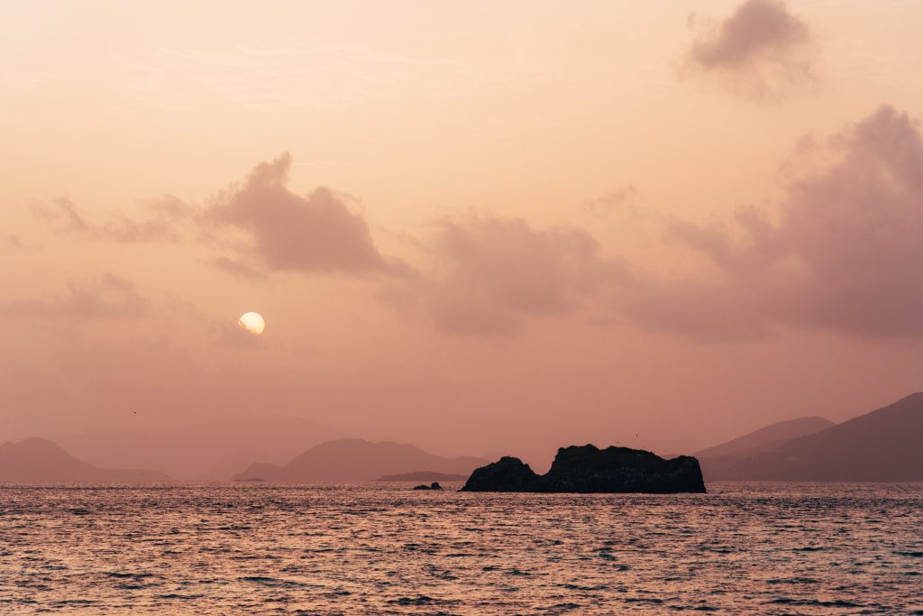
To give you an overview of the trip, we based ourselves on Saint Thomas, where we explored the city of Charlotte Amalie and photographed sunrise and sunset on several of the island’s beaches. From there we spent a day on Saint John, stopping at a few spectacular viewpoints and gorgeous beaches. Our last day of exploring took us to the BVI for quick stops on Virgin Gorda and Jost Van Dyke, giving us a broader view of the area as our boat cruised between islands. Click on any image to read more.
Please ignore this text box - Recoleta Font



I totally relate to this! Editing travel photos in Lightroom has become one of my favorite rituals after every trip — it’s like reliving the adventure. I usually start by adjusting light and warmth to capture the mood I felt on location. Once I’m done, I upload my favorites to groovebook so I can flip through them later instead of just scrolling on my phone. There’s something special about holding printed memories in your hands. It’s funny how a bit of editing and a small photo book can make even an ordinary snapshot feel like a piece of your personal story.